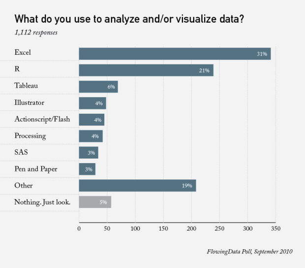
A couple of weeks ago I asked what you all use to analyze and visualize data. Here are the results.
As of writing this, there were 1,112 responses. Thanks for participating, everyone!
Microsoft Excel led the way, like you’d expect, with a 31% share. R was pretty close for a while, but fell behind with a 21% response. This is almost the same as the results from the same poll two years ago. There was a 30/20 split. The newcomer this time around was Tableau, which surprised me, coming up in third with a 6% share. I didn’t include Tableau in the previous poll, although a few people did mention it in the comments.
Actionscript/Flash, Illlustrator, Processing, SAS, and pen and paper got their small share.
Finally, there was a wide variety of software mentioned in the comments from those who answered the ‘other’ category. Some of those included Matlab, SPSS, Stata, and Python.
While I don’t think this is representative of the chart-making population, it’s easy to see that there’s a lot of solutions to interpret data. Here’s quickstart guide in case you’re wondering what to use.
Will Excel always be the frontrunner?
 Visualize This: The FlowingData Guide to Design, Visualization, and Statistics (2nd Edition)
Not surprising! Did you collect the ‘other’ responses?
I didn’t do a full count of the ‘other’ since only a small portion of people who answered ‘other’ commented on what they use. But a quick scan showed the ones I mentioned above as the most prominent in the ‘other’ category.
Tableau is coming on strong. I haven’t used it much, but my impression is that it’s easy to use and its output is attractive and uncluttered. Next poll, I’ll bet it’s close to R.
This isn’t too surprising. I use excel for quick data work and analysis – I wouldn’t use it to produce serious reports, but it’s really good for getting quick one-time results and, above all, figuring out what’s the most interesting to analyse. Most of the reports and graphs automagically generated from the databases at work started off with some excel spreadsheets and me saying ‘well, that’s an interesting way to look at it..’
I’m surprised that SAS is so low in the list. I would have expected it to be a bit higher. I’d like to see the top responses in Other by descending order.
Also, why is SAS and Pen/Paper both 3%, but the bars are unequal in length – might want to go out that first decimal. I would also expect Tableau to almost double if this is run in about 6-9 months. I wonder if Spotfire was in the Other section…
It may be that SAS is not the first tool (or that SAS makes a lot of ugly charts without a lot of tweaking).
While I certainly use SAS and a lot of the data will come from SAS even if it is not graphed there…I would still have to say that my primary tool at work is Excel. Excel charts are quick to make and easy to annotate (and they can be sent to other people who can edit them)…Charts in 2007 look great with some tweaking and merge better into powerpoint.
If I want to make a lot of similar charts (or make lots of data changes to one chart…like extending a range of daily data), it makes much more sense to do it with a program but for a one-off chart to see what a piece of preexisting data looks like…excel is quick.
Excel has the lowest learning curve and is installed on most work PCs, so I’m not surprised that it’s the leader. For my purposes, a souped-up Excel graph is good enough, and requires the least amount of effort to create for the relatively simple data points I normally am using. If I had more complex data, I could see the potential need for something more robust.
For me, the main deciding factor in software choice depends on the answer to the following question:
“Will I need to regenerate this data/picture again at a later date?”
If the answer is no, I go with Excel. If the answer is yes, I go with something else (actionscript/Flex for me). Most of my work is repeated monthly, so I answered actionscript/Flex, but all my work probably begins in excel.
Just curious if others make this distinction. Do people take the time to make their excel charts accept varying datasets should they be reused in the future? (e.g. simply more rows for a time series). Or are most pictures on-off to begin with?
I have a similar process, although I usually ask myself if it’s simple enough to do in Excel. If not, I do it in Python.
If you don’t mind my asking, what Python modules do you prefer to work with for data analysis / visualization? Visualization Toolkit, etc.?
Thanks,
Kevin
@Kevin – I actually do very little visualization in Python. Aside from Web development via Django, I mostly use Python to parse and reformat data. BeautifulSoup has come in handy for XML and HTML stuff.
R is usually my old standby for graphics and analysis.
Scipy, Numpy, Matplotlib, etc.
I highly reccomend getting the “Beginning Python Visualization” book.
I do a lot of visualization for recurring reports… split almost evenly between Tableau and Excel. What often drives my choice between the two is the final format for the report…. It’s easier for me to have a “linked” version of the report in Word or PPT that has an OLE link to an Excel chart. After refreshing the data (often done by tweaking one or two cells in the spreadsheet to trigger a refresh of data from a database), “Save as” the Word/PPT to a new filename, break the links to Excel and distribute my report. Tableau is used heavily where I want my audience to be able to interact with the data, and tweak various filters to find the nugget that applies to them. Tableau (in conjunction with the free Tableau reader) seems to be one of the quickest and most affordable ways to generate and distribute interactive visualizations/dashboards. A major plus for Tableau is that it defaults to generating charts that adhere to good data visualization practices. (I’m constantly trying to coach coworkers and superiors to accept Tableau’s defaults and stop trying to load them up with Excel-like chart junk.)
I’ts nice to see so many people using R.
I started using R several years ago because my stats professor required it. After having used it for several years, R is definently my preferred tool for data analysis and visualization. Sure, I also use Python, Matlab, Excel, and other tools, but R is by far the tool I use first for everything.
I recently checked out some of the new visual programming interfaces for R, such as Red-R. It’s possibly that more people could start using R given these “easier” tools. Next time you conduct this poll, R may have overtaken Excel.
http://www.red-r.org/
For this blog, R might take over, since I’m constantly pitching it, but universally, probably not.
I don’t know about R. It’s very capable, but by itself it’s not accessible to very many people. Excel is already on everyone’s desktop, and it’s not hard to get started, though making a very good graphic takes work. The way Tableau has exploded on the scene, with great capabilities and formats, and with its ease of use, I think it’s the package to watch.
I’ll have to take a look at Red-r…. I’ve experimented with R a bit, but it is rather daunting to the newbie. I agree with Jon that Tableau is one to watch. If you’ve ever dabbled with it in the past, take another look when the 6.0 version is released later this fall. (I’ve seen demos and been testing the beta.)
Question for Tableau users:
Do you use the Tableau Public?
I’ve noticed that Tableau has the free tool (Tableau Public) and the very expensive commercial release. Which one do you use?
I’d like to start using Tableau, but I just can’t imagine spending that much money for software.
I started w/ Tableau Desktop Pro ~1.5 yrs before Tableau Public was released. Tableau Public is great for work with public data or data that doesn’t need to be kept confidential. I thought Tableau was pricey, too. But it’s quite reasonable compared to other commercial options. (Particularly for the fortune 500 company for which I work.) And when one considers that the Tableau Reader provides a significant amount of interaction for users with no license fees, it’s even more reasonable.
ok excel, but quite surprising to me R (21%) and Tableau. On the other hand, SPSS, all the opesource data mining projects (weka, knime, rapidminer…) and all other BI suites, are less used than “penn & paper”! Amazing
RE: or that SAS makes a lot of ugly charts without a lot of tweaking …
I counter that statement with Excel defaults make very poor charts that require the removal of many bad elements vis a vis good data visualization practices. SAS defaults result in a very plain chart to which one can add enhancements if necessary.
Let’s just all agree not to stop at default :)
You forgot to list Rapidminer, especially now with the new R integration. =)
this poll is very misleading, since it is missing real leaders: qlikview and spotfire
#ap, I like both, qlik & spotfire, but how do you know they are leaders. I mean, is there any research, ranking, on the issue?
Speaking of Excel, see secret #1 of the seven secrets of successful data scientists: http://dataspora.com/blog/the-seven-secrets-of-successful-data-scientists/
We tend to use Python for our cleanup, BIRT for our reporting and R for our Stats. All doing more than they should on some projects and less than they should on others.
Any recommendations for creating Tufte-compliant charts in R?
Got some great plugins for Excel courtesy of Juice Analytics… how to make such beautiful charts in R? Anyone?
This is probably not the answer you’re looking for, but you can do a ton if you save the R plot as a PDF and then bring it into Adobe Illustrator for further editing.